The solar siting project found that grid access, not sunshine, decides where Texas solar gets built. This is the sequel: it measures the fight for grid access itself — the interconnection queue where every proposed plant waits for permission to connect.
Four questions, all answered in SQL: where does the next wave of generation want to connect? Which counties face the most queue pressure? What fraction of applicants historically survive? And what role does interconnection cost — the sharpest critique of the first project — actually play?
A queued project is an application, not a plant. The queue doesn't forecast the grid — it reveals where developers want to build, before economics thins the crowd.
| Queued fuel | GW | Share |
|---|---|---|
| Battery storage | 162.4 | 37.4% |
| Solar | 151.7 | 35.0% |
| Gas | 69.7 | 16.1% |
| Wind | 47.1 | 10.9% |
| Other | 3.0 | 0.7% |
1,714 large-generation projects, 433.8 GW total (ERCOT GIS Report, June 2026, after cleaning). For scale: all operating Texas generators in EIA-860 total 179.6 GW.
ERCOT publishes no coordinates — each project gets a county and a named point of interconnection like "59903 Bearkat 345kV" or "Tap 345kV 76003 Big Hill - 60708 Orsted". Turning 1,714 of those strings into geometry is itself the analysis: a normalizer strips bus numbers, voltage tokens, and generic words, then pg_trgm trigram similarity matches each POI to OpenStreetMap substations within the project's county plus a 15 km buffer.
The match rate is 47.6% — 816 projects, 316 of them exact name matches after normalization — and it is published, not hidden. The rest fall back to county centroids and carry a loc_method flag that excludes them from every location-sensitive claim. A hand-review of 30 random matches found all 30 plausible.
A trap, documented instead of hidden: matched projects sit 6–8 m from a transmission line by construction — their assigned point is the POI substation, and substations sit on lines. So "distance to grid" is never used analytically for queued projects here; that circularity check is kept in the repo as a diagnostic.
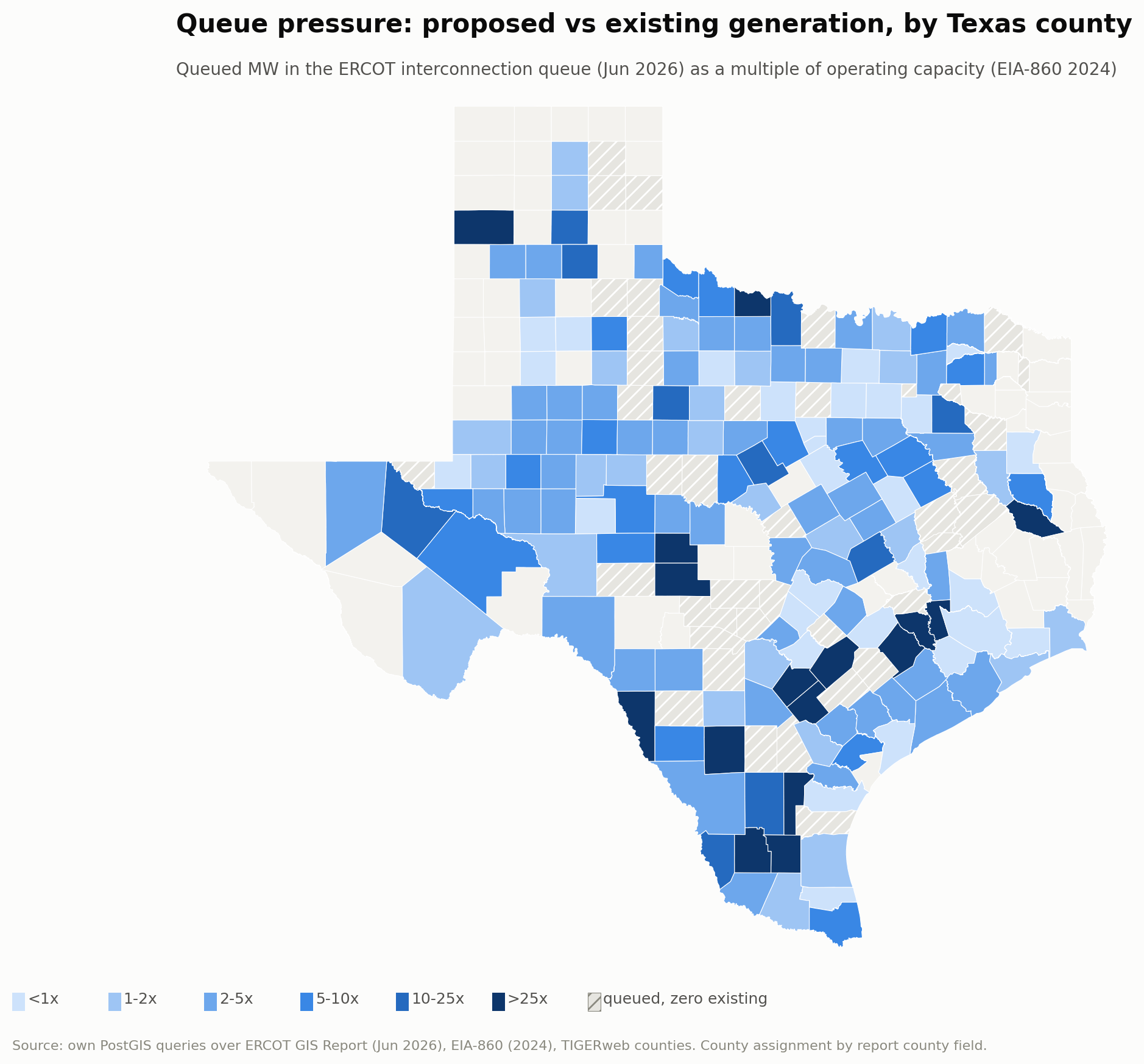
Aggregating queued MW against the operating fleet county by county shows the queue is not where the fleet is. The extreme pressure ratios cluster in counties with almost nothing operating today — led by Anderson (4.8 GW queued, zero operating) and Caldwell (4.7 GW, zero) — a map of where developers believe the grid's next frontier lies.
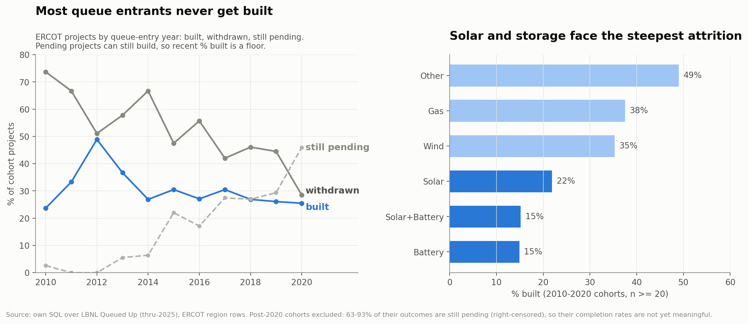
Across the 2010–2020 entry cohorts — 1,199 ERCOT projects — only 28.8% reached commercial operation; 46.5% formally withdrew, and 24.8% are still pending. Completion splits hard by fuel: gas 37.5%, wind 35.3%, solar 21.9%, standalone batteries 14.9%.
Post-2020 cohorts are excluded entirely: 63–93% of their outcomes are still undecided (right-censoring), so their completion rates would be artifacts of not waiting. Even within the window, 46% of the 2020 cohort is unresolved — recent-cohort rates are floors, not final values, and the page says so.
Readers of the siting project argued its grid-hugging result is really a cost result. They're right about the mechanism — and in ERCOT the two explanations are one. Under ERCOT's "connect and manage" regime, the developer pays for its gen-tie to the point of interconnection while deeper network upgrades are largely socialized, so distance to the existing grid approximates the developer's dominant location-dependent interconnection cost. No public project-level cost data exists for ERCOT (Berkeley Lab's cost studies cover other regions), so distance is also the only honest proxy.
Two results, and they cut in different directions:
- Cost shapes siting before queue entry. Nearly half of queued projects name an existing substation as their interconnection point — requests are placed on the network that exists. The corridor-hugging in the siting model is the footprint of gen-tie cost minimization at site selection.
- But grid sparsity does not predict who survives. If long gen-ties killed projects after filing, withdrawal should fall as county transmission density rises. It doesn't: 47.8%, 63.0%, 52.9%, 49.3% across density quartiles, sparsest to densest — no gradient, and the same holds for solar and wind alone.
The consistent reading: developers internalize gen-tie cost when they pick sites, so projects that cost would cripple mostly never file — and attrition after filing is driven by other things. Cost decides where you queue, not whether you survive the queue.
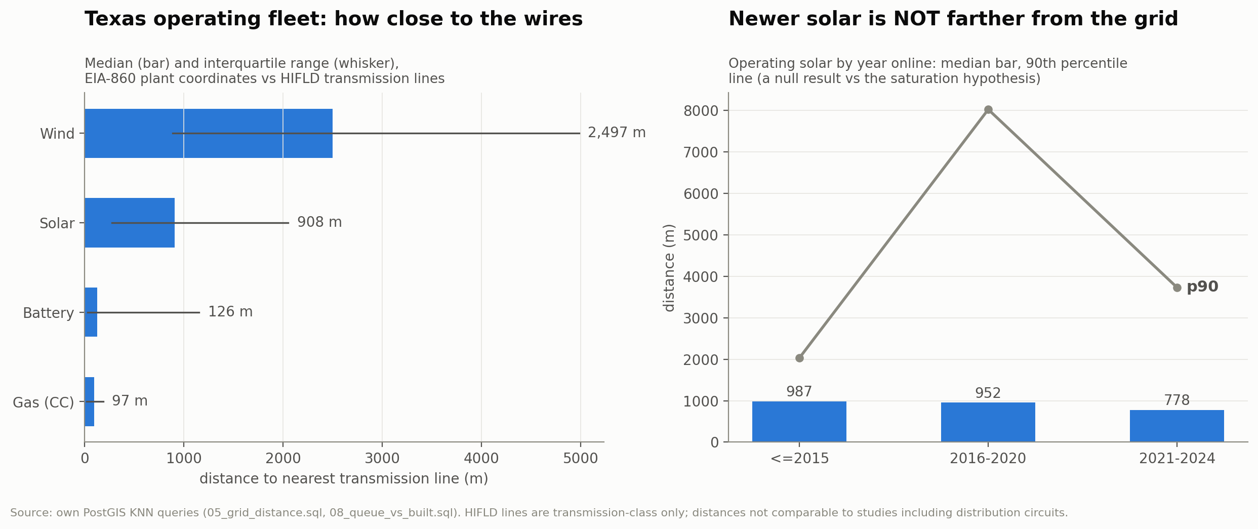
An obvious sequel hypothesis — grid-adjacent land is filling up, so newer solar must sit farther from the wires — fails the test. Solar that came online 2021–2024 sits a median 778 m from transmission versus 952 m for the 2016–2020 vintage, and the 90th percentile fell from 8,024 m to 3,730 m. Wind drifted the other way (1,867 m → 3,841 m). Missing post-2023 lines in the HIFLD data could only overstate distances for the newest plants, so the null survives that bias too. Null results that would have made a better story build more trust than another 9×.
| Query | Before → After | Speedup |
|---|---|---|
| KNN nearest line, 2,221 plants | 12,834 → 88 ms | 146× |
| Trigram POI candidate join | 35,211 → 1,747 ms | 20× |
The schema deliberately ships with no indexes; a tuning script captures EXPLAIN (ANALYZE, BUFFERS) before and after creating GiST geometry indexes and a GIN trigram index, with full plans preserved in the repo. The plan shape flips from per-row sequential scans to index probes.
One wrinkle, disclosed before anyone asks: the GIN trigram index is idle in the join plan — similarity(a,b) >= 0.45 is an expression the planner can't index; only the % operator is accelerated. The 20× win comes from the GiST ST_DWithin probes, and a %-operator demo in the repo shows the GIN index working (~1 ms) when addressed correctly.
Six public datasets — the ERCOT GIS Report (Jun 2026), LBNL Queued Up (thru-2025), HIFLD transmission lines, OpenStreetMap substations, EIA-860 (2024), and Census TIGERweb counties — loaded into PostGIS (EPSG:6580, metres) by a thin Python loader; every analysis is a numbered SQL script runnable top to bottom, and every number on this page traces to a preserved query output.
- POI match rate is 47.6%; centroid-fallback projects are excluded from location-sensitive claims. Line-tap POIs match one endpoint substation, with location error up to the segment length.
- Substations come from OpenStreetMap (the public HIFLD layer was retired), under ODbL — unnamed OSM substations depress the match rate, so 47.6% is partly a coverage number.
- HIFLD lines are transmission-class only, last edited 2023; absolute distances aren't comparable to studies that include distribution circuits.
- The cost test is a county-level (ecological) proxy on 552 settled projects, not per-project gen-tie length.
- Nothing here forecasts ERCOT capacity adequacy: the queue measures intent, not supply.
Open the SQL & the evidence
Ten SQL scripts, preserved query plans, every summary table as CSV, and a README where the caveats are the point.