Live dashboard. Air quality updates hourly from EPA AirNow. Best viewed full screen.
A standard air quality map shows where the air is bad right now. It says nothing about whether the communities least equipped to cope are the ones being measured.
When pollution burden and monitoring coverage diverge, vulnerable neighborhoods can sit in a blind spot: exposed but unmeasured. This dashboard maps where that happens in the Houston metro.
The analysis identifies the socially vulnerable communities in Houston-Galveston-Brazoria that face high air pollution burden yet lie farthest from the nearest air quality monitor.
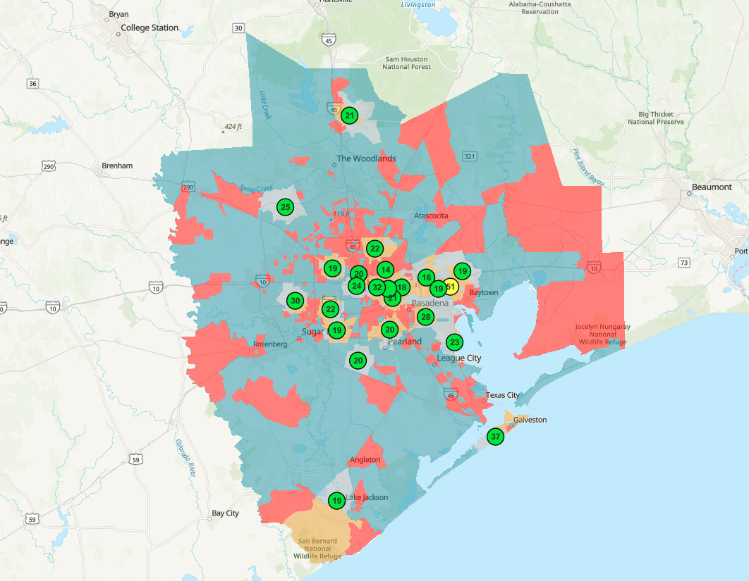
Of the metro's 1,595 census tracts, 399 are "priority" tracts: both highly socially vulnerable and beyond neighborhood-scale monitoring coverage. They cluster along the industrial eastern corridor toward the Ship Channel and Baytown, and across the northern and outer fringes, while the regulatory monitors sit mostly in the central core.
Most of these priority tracts fall in Harris County.
The dashboard combines data that update on very different schedules, so I built it in two halves.
The live layer pulls current air quality from the EPA AirNow hosted feature layer, which refreshes every hour. It drives the current maximum AQI, the count of monitors in the moderate range, and the ranked chart of the worst-air sites right now.
The structural layer rests on monitor locations and tract vulnerability. These do not change hour to hour, so they are frozen at analysis time.
| Layer | Updates |
|---|---|
| Current max AQI | Hourly (live) |
| Monitors in moderate range | Hourly (live) |
| Worst-air sites chart | Hourly (live) |
| Priority-neighborhood map | Structural snapshot |
| Priority count by county | Structural snapshot |
Live AQI feeds the indicators where timing matters. The equity classification uses only the stable quantities.
I built the equity layer in ArcGIS Online in four steps:
- Create Buffers around every monitor at a 4 km radius, EPA's neighborhood scale of representativeness.
- Find Closest to compute the straight-line distance from each of the 1,595 tracts to its nearest monitor.
- Join Features to attach that distance to the CDC Social Vulnerability Index tract layer on the census FIPS code.
- Classify every tract with an Arcade expression into a 2×2 scheme crossing vulnerability (high if SVI ≥ 0.75) with coverage (under-monitored if > 4 km), producing the four-class bivariate map and the stored priority flag.
Each cutoff comes from federal guidance or published work:
- High social vulnerability: CDC/ATSDR SVI 2022 overall percentile ≥ 0.75. This top national quartile is the break used by the CDC/ATSDR SVI Interactive Map and the most common cutoff in the environmental-justice literature.
- Monitoring desert: nearest monitor more than 4 km (about 2.5 miles) away. This is the upper bound of EPA's "neighborhood scale" of representativeness (40 CFR Part 58 Appendix D), and the same coverage radius Kelly et al. (2024) applied to this regulatory network in JAMA Network Open.
- Classification: a 2×2 priority flag for the headline metric, paired with a bivariate choropleth for the map, following standard cartographic guidance to keep bivariate maps legible.
- Distance is measured straight-line. The question is whether a monitor's sampled air parcel reaches a tract, and EPA defines its spatial scales as straight-line air-parcel dimensions, so Euclidean distance matches the construct better than road-network travel distance would.
Data: U.S. EPA AirNow (live hourly AQI); CDC/ATSDR Social Vulnerability Index 2022 (census tract); nearest-monitor distance computed in ArcGIS Online. Air quality is current as of viewing; vulnerability reflects the 2022 SVI release.
This is a screening tool, and several limits apply:
- Live AQI is a preliminary, unvalidated hourly snapshot, shown for situational awareness rather than regulatory determination. These values are not built into the tract analysis; the equity layer uses monitor locations and vulnerability, which are structural.
- Regulatory monitors are sited for regional compliance, not neighborhood exposure. That sparse coverage limits any claim about individual exposure; it is also the reason the coverage gaps exist at all.
- Tract-level results carry the ecological fallacy and the modifiable areal unit problem: a tract average is not an individual's experience, and results can shift with the choice of spatial unit.
- SVI is a relative national ranking, so "high vulnerability" means high relative to all US tracts. HGB skews more vulnerable than the national median, which is part of why the priority count is large; a stricter cutoff (SVI ≥ 0.90) would isolate a smaller, more acute set of tracts.
ArcGIS Online (Map Viewer, hosted feature layers, spatial analysis: Create Buffers, Find Closest, Join Features), ArcGIS Dashboards (indicators, serial charts, bivariate symbology, filters), Arcade expressions for the derived classification and dashboard logic, live-feed integration, and data integration across federal air quality, federal vulnerability, and census geography sources.
Open the live dashboard
Real-time air quality and the full monitoring-equity analysis, interactive and public on ArcGIS Online.